How to create a Parisian apartment look (without the Parisian rent)
The last time I staged a rental in a Haussmann building near Bastille, I had four days, a landlord who refused to let me touch the walls, and a budget that would embarrass a student. I ended up with a space that photographers kept mistaking for a pre-war original. Cheap. Reversible. Completely fake in the best way.
That's the whole trick of the Parisian apartment look: it is far more forgiving than people think. You don't need a real parquet de Versailles or a 3.4-metre ceiling. You need a specific visual grammar — mouldings, herringbone, aged brass, pale plaster walls, one dramatic mirror — and you need to know which parts of that grammar carry the weight and which are decoration.
I've now recreated this style in six apartments. Two of them went badly, and I'll show you exactly why. The rest took a weekend or less. Here's what actually moves the needle.
Key Takeaways
- The Parisian look rests on four anchors: wall detailing, the floor, aged metals, and one oversized mirror.
- You can fake mouldings and herringbone for a fraction of the cost, and both are fully removable in a rental.
- Ceiling height matters more than square metres — train the eye upward with a low-hung light.
- Avoid the "beige staging" trap: Parisian interiors feel lived-in, not photographed for a brochure.
- Buy the mirror last. It's the piece that finishes the room, and you can't size it until the rest is in place.
What actually makes a home look Parisian
Walk into a genuine pre-war Paris flat and the first thing you notice isn't the furniture. It's the architecture of the walls. Then the floor. The furniture comes third, and honestly, most of it is unremarkable.

This is where almost every attempt I've seen online goes wrong. People buy the objects — the gilded mirror, the crystal chandelier, the peonies — and skip the shell. The result reads as "French-themed", not French.
The four anchors
Every convincing Parisian room I've built or visited shares the same skeleton:
- Wall mouldings — crown moulding near the ceiling and rectangular panel frames on the walls
- A herringbone or chevron floor, or something that reads that way from standing height
- Aged brass, tarnished gold, or unlacquered metal in at least three touchpoints
- One very large mirror, ideally with a gilded or beaded frame, leaning or hung low
Notice what's missing from that list. No chandelier, no flowers, no "vintage" books stacked by colour. Those are garnish. They cost money and they contribute almost nothing on their own.
Why ceiling height beats floor space
Here's something I learned the hard way. In 2022 I spent a week trying to make a low-ceilinged studio feel Parisian. New floors, new mouldings, the works. It still felt like a well-decorated basement.
The reason is that the Parisian impression is fundamentally about vertical air. Old Parisian buildings were built tall and narrow, and every design decision inside them — the tall windows, the long curtains, the picture rails mounted high — pushes your eye up.
You can simulate this. Hang your curtains at the ceiling line, not at the window frame. Mount your mirror higher than feels comfortable. Choose a pendant light with a small canopy and a long drop, hung so the bottom sits roughly 75–90cm above the table. Before you buy anything, walk into the room, sit down, and look straight ahead. If your gaze lands on bare wall with nothing directing it upward, no amount of brass will save you.
How to fake the mouldings and floor (the part everyone skips)
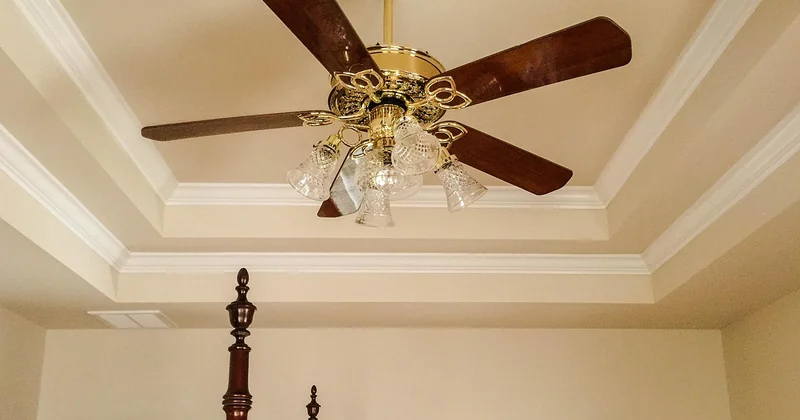
Real plaster mouldings are beautiful and expensive and, in a rental, illegal to install. I've priced it twice. For a standard 20m² living room, running genuine cornice and wall panelling through a plasterer cost me a quote I'm still slightly angry about — well over what I paid for every piece of furniture in that room combined.
The alternative works better than you'd expect.
Mouldings that come off in an afternoon
Adhesive-backed foam or polyurethane moulding strips have gotten genuinely good. Not "good for the price" — good, full stop. At standing distance, nobody detects them. The failure mode is entirely in the installation.
- Clean the wall. A single greasy fingerprint will kill the bond.
- Mark your panel rectangles in pencil first. Symmetry matters more than precision of size.
- Keep panels 15–20cm apart from each other and from the ceiling line. Cramming them looks cheap instantly.
- Press for a full 60 seconds per section. I've watched panels fall in the middle of the night because I rushed this.
The one thing I'd tell you to spend real money on instead: the skirting. Adhesive skirting always looks adhesive. A cheap pine skirting board, painted the same white as your walls, pinned in place, reads as original.
Herringbone without lifting a floorboard
Three routes, ranked by how convincing they are:
| Option | Realism | Cost | Rental-safe |
|---|---|---|---|
| Vinyl or LVT laid in a herringbone pattern | High from standing height | Moderate | Yes, if loose-laid |
| Large herringbone-pattern rug | Medium — reads as textile, not floor | Low | Yes |
| Painted chevron on existing floorboards | Low to medium, and irreversible | Low | No |
I'd take the loose-laid LVT every time. It's the single highest-impact change in the entire project. On one flat I did this in a single Saturday and the room went from "generic rental" to "someone's grandmother lived here" before I'd hung a single picture.
Colour matters here. Aim for a warm mid-oak, not the grey-washed tone that's dominated for a decade. Grey floors kill the effect. The whole point is warmth against pale walls.
The palette, and the objects that carry the room
Parisian interiors are not white. This is the most common mistake I see in recreations, and I made it myself on my first attempt. I painted everything bright white, and the flat looked like a dental clinic.
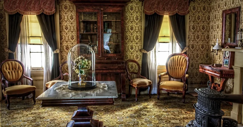
The walls in most Parisian apartments are a variation on off-white with a hint of something — grey, cream, occasionally a soft green or a dusty pink. My reliable formula:
- Walls in a warm off-white with a touch of grey, in a matte finish
- Ceiling and mouldings in the same white, one shade lighter
- Doors and window frames in a soft grey-green or a deep muted grey
- One accent: a single wall in a dusty terracotta, sage, or deep navy — never more
The mirror, and where to put it
Buy the mirror last. I know that's annoying advice, but the size only becomes obvious once the furniture is in. A mirror that's too small is the fastest way to make a room look like a hotel lobby.
Aim for at least 60% of the width of whatever it sits above — a fireplace mantel, a console, a sideboard. Gilded frames are the classic, but a tarnished brass frame or a chunky painted wooden one works just as well. Sit it on the mantel and lean it against the wall rather than hanging it. The lean is what makes it look inherited rather than bought.
Brass, light, and the "lived-in" rule
Aged brass in three places is enough. More than five and it tips into a showroom. Good spots: a pair of wall sconces either side of the mirror, door handles, the frame of the mirror itself, a floor lamp on a slim stem.
Lighting temperature is where most recreations fail. A Parisian flat at night is warm — think 2200–2700K, no overhead ceiling light ever, multiple small pools of light instead. If you can see the bulb, you've done it wrong. Add a shade, or lower the fixture.
And the "lived-in" rule: one thing in the room should look misplaced. A stack of books with mismatched spines. A single worn leather chair. A slightly too-large plant. Perfection reads as staging, and staging is the opposite of what you're after.
Parisian style on a budget, and in a rental
My lowest-spend version came in around the price of a mid-range sofa, and it covered a 24m² living room end to end. The proportions below are what I've used since:
- Floor — roughly 35% of the total spend
- Mouldings and skirting — about 15%
- Mirror — 20%, and it's the piece worth waiting for
- Lighting and brassware — 15%
- Everything else — the remaining 15%, and no more
Sourcing is mostly about patience rather than budget. Flea markets and online secondhand listings are where the gilded mirrors and old brass actually live. New "vintage-look" mirrors from large retailers are almost always obvious — the gold finish is too uniform. Tarnish is your friend.
What to do when you can't touch anything
Every element above except the skirting is reversible. Adhesive mouldings come off with a hairdryer and a plastic scraper. Loose-laid floor tiles lift right back up. Curtains hung from a ceiling-mounted rail leave two small holes you can fill in ten minutes with a dab of filler and matching paint.
Take photographs before you start. I once spent an afternoon undoing a landlord's reaction to a wall I'd painted without asking, and that conversation was entirely avoidable.
The bedroom, and making small spaces work
Bedrooms follow the same anchors, with one shift: dial the drama down and the softness up.
Wall panels behind the bed, a linen headboard rather than a fabric one, mismatched bedside tables — genuinely mismatched, not a matching pair with different handles — and a single low pendant instead of a chandelier. Bedding in washed linen, in a warm neutral. That's the room.
For a studio or anything under 25m², the rules tighten:
- Pick one anchor to execute properly and leave the rest simple. In a small space, trying to do floors and mouldings and panelling makes it feel cramped, not grand
- Mirrors opposite windows, always. They double the light and the sense of depth for free
- Keep the floor as empty as possible. Legs on furniture, nothing solid to the ground
- One large artwork beats four small ones, every time
The mistake I made in that first studio was trying to make it feel big instead of making it feel considered. A small Parisian flat isn't impressive because of its size. It's impressive because every object in it has a reason to be there.
Which is probably the real answer to this whole question. You're not copying mouldings and mirrors. You're copying a way of filling a room deliberately, over time, with things that have earned their place. Get that right and the aesthetic follows — even in a fourth-floor walk-up with a suspiciously low ceiling.